The brief
Sobremesas & Companhia is small on purpose. Two people handle every order from first message to setting up the table on the day, for parties of 15 to 200 guests, delivering across the Porto district and the Minho. Until now, all of that ran through Instagram and direct messages — which works, right up until someone wants to send a link to their sister and ask “what do you think of these?”
So the goal was simple: one page that shows the work, explains how ordering works, and makes asking for a quote as easy as sending a message. No accounts, no checkout, no CMS to babysit.
What’s on the page
sobremesasecompanhia.pt is a single scroll in five parts:
- Hero — what they make and for which occasions, with a quote button front and centre.
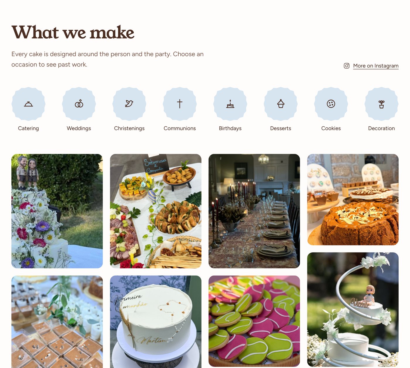
- Creations — a gallery of 83 photos, filterable by occasion (weddings, christenings, communions, birthdays, desserts, cookies, catering, decoration). It shows twelve at a time, so the first screen is a taste of everything instead of a wall of cake.
- How to order — three steps: tell us about the event, get a tailored proposal, we handle the day.
- Where we are — the kitchen in Santo Tirso and the towns they deliver to.
- Request a quote — the form, plus a direct WhatsApp link for people who’d rather just talk.
The design comes from the cakes
We didn’t invent a brand — they already had one, in their logo and Instagram highlight covers. The palette is lifted straight from there: sugar white, powder blue, chocolate brown and a blush pink for the quote section. Headings are set in Young Serif, body text in Figtree.
The one signature detail is the scalloped edge you see on the section borders and the occasion badges. It’s the edge of a paper cake doily, already used on their highlight covers, and it’s done entirely in CSS with a radial-gradient mask — no images, so it stays crisp at any size and costs nothing to load.
The photos
The gallery mixes eight images from their Instagram feed with 75 from their own originals. Every original was exported at 1400px max, renamed by occasion (casamento-bolo-orquideas.jpg rather than IMG_4821.jpg), and stripped of EXIF and GPS data — a lot of those photos were taken at clients’ homes and venues, and that’s not something a public website should be quietly publishing. Each photo has a written caption, which doubles as its alt text.
What it’s built with
| Piece | Choice |
|---|---|
| Framework | Next.js 16 (App Router), React 19, TypeScript |
| Styling | Tailwind CSS 4, design tokens in one CSS file |
| Fonts | Young Serif + Figtree, self-hosted via Fontsource |
| Output | Static export — plain HTML, CSS and images |
| Hosting | GitHub Pages, deployed by GitHub Actions on every push to main |
The important line is the fourth one. There is no server. next build produces a folder of static files, and that’s the whole website. It loads fast, it can’t go down because a database did, and it costs nothing to host. Next.js earns its place for the developer experience — components, typed content, a proper build — not for anything that has to run in production.
A quote form with no backend
The obvious way to do a contact form is to send it somewhere: an email service, a form API, a database. We skipped all of that, because their customers already talk to them on WhatsApp.
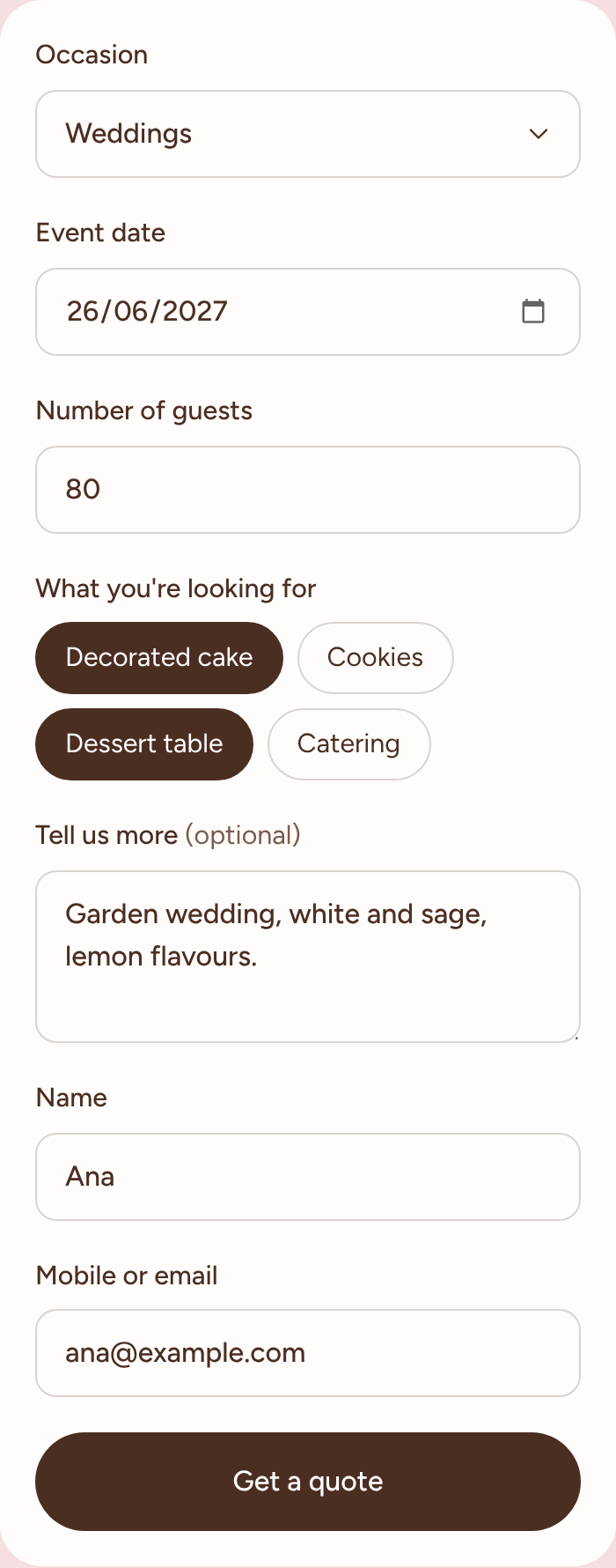
The form asks for the essentials — occasion, date, number of guests, what they’re after (cake, cookies, dessert table, catering), a free-text note, name and contact. On submit, it assembles that into a tidy message and opens WhatsApp with it already written, addressed to them. The customer reviews it and taps send. The couple gets a complete request in the app they already live in, instead of a “hi, how much is a cake?” that takes four messages to untangle.
No form provider, no spam filter to tune, no inbox nobody checks. If WhatsApp isn’t configured, it falls back to a pre-filled email.
Four languages, checked at build time
Not every customer, or every guest choosing a cake, reads Portuguese, so the site is in Portuguese, English, Spanish and French. Portuguese is the default at /; the others are full static copies at /en/, /es/ and /fr/, with a language switcher in the header and hreflang links so search engines serve the right one.
All the page text lives in one dictionary per language, and the English, Spanish and French ones are typed against the Portuguese one. Forget to translate a string and the build fails — so a half-translated page can’t ship by accident. The gallery captions carry all four languages too, and the WhatsApp message the form writes is in whichever language the visitor is reading.
What comes next: the platform
The landing page is the front door. Behind it, we’ve started on something bigger for Sobremesas & Companhia: a platform to run the business itself, beyond what a static page can do.
We’re not going to describe it here — it deserves its own post, and it’ll get one once there’s something real to show. For now: the landing page was built so it can grow into that without being thrown away, and you’ll hear about it on this blog first.
Have a look
The site is live at sobremesasecompanhia.pt, and the code is public at cookiebytespt/sobremesas-companhia-landing. If you’re planning a wedding in the north, you know where the cake is.
Running a small business that lives in your DMs? We build sites like this one — fast, multilingual, and wired into the way you already work.